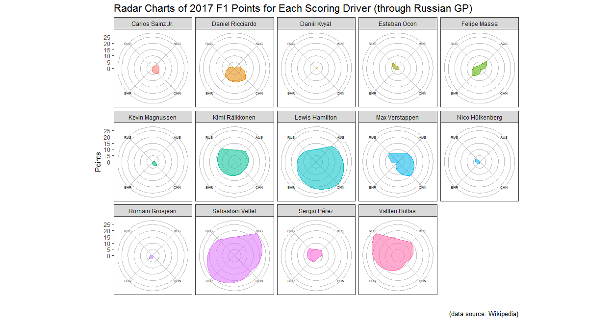
Radar Charts of Drivers' Points for 2017 F1 Season (through Russian GP)
I'm totally into these ggplot2 faceted radar charts. Here's another set, this time depicting the points earned by Formula 1 drivers for each of the four races of the 2017 F1 season to date, according to this Wikipedia page. For those who are not familiar with F1 scoring, here is how it works for the 2017 according to formula1.com:
"At the conclusion of each Grand Prix, the top ten finishers will score points towards both the drivers’ and constructors’ world championships, according to the following scale: 1st : 25 points, 2nd : 18 points, 3rd : 15 points, 4th : 12 points, 5th : 10 points, 6th : 8 points, 7th : 6 points, 8th : 4 points, 9th : 2 points, 10th : 1 point"
I included only those drivers who have finished in points positions. The four spokes of the radar charts are each of the four races. The farther out along one of those spokes the shaded area extends, the more points that driver earned in that race. The larger the overall area of the shaded area, the higher the driver's total points for the season. The charts are arranged in alphabetical order of the drivers' first names.
At a glance, you can tell who is doing well, how consistent they have been, and (because the spokes of the plots are arranged in clockwise chronological order of the races) what their form has been over time. I know that the table form of this data tells you all you need to know, but I really like the visual component to these radar charts. Much more interesting to look at than a list of names and numbers, I think.
These charts do reveal one of the limitations of these kinds of plots. For those drivers who scored in only 1 race, an area is still created even though there aren't enough points to do so. ggplot2 handles this by creating an area anyway, which leads to the appearance of points-scoring along axis/races for which the driver actual has no points (e.g., Romain Grosjean's radar chart, for which the plotted values are 0, 0, 4, and 0 for AUS clockwise to RUS). Good to know.
There wasn't much in the way of personal coding leaps forward with this exercise. The biggest issue really was translating each driver's place into a score for each race. I could not find any tables that listed points earned for each race rather than points or classification status. Translating this in R turned out to be trickier than I thought, as some of the numbers for positions are the same as the numbers for points. I had to figure out the right order to make the substitutions, but in the end there was a solution.
The only real R lesson for me here was that when changing factors into numbers using as.numeric, one should have an intermediate step using as.character, like so:
Before I figured out that I had to do this important step, every time I tried to change a column in my dataset from factor to numeric, the values in each row of that column would change places. Passing them through as.character first solved this problem, which is alluded to in the vaguest possible terms in the examples at the end of the documentation for as.numeric.
Lastly, I did figure out how to change the color of the grid lines and made the charts slightly larger by increasing the number of columns into which the charts were arranged. The theme code for changing the color of the grid lines had to precede the facet function or else no change was made. As for the number of chart columns, that can be changed through the ncol argument within the facet function. Here is the relevant part of my ggplot function illustrating both of these points:
"At the conclusion of each Grand Prix, the top ten finishers will score points towards both the drivers’ and constructors’ world championships, according to the following scale: 1st : 25 points, 2nd : 18 points, 3rd : 15 points, 4th : 12 points, 5th : 10 points, 6th : 8 points, 7th : 6 points, 8th : 4 points, 9th : 2 points, 10th : 1 point"
I included only those drivers who have finished in points positions. The four spokes of the radar charts are each of the four races. The farther out along one of those spokes the shaded area extends, the more points that driver earned in that race. The larger the overall area of the shaded area, the higher the driver's total points for the season. The charts are arranged in alphabetical order of the drivers' first names.
 |
| (click to enlarge) |
At a glance, you can tell who is doing well, how consistent they have been, and (because the spokes of the plots are arranged in clockwise chronological order of the races) what their form has been over time. I know that the table form of this data tells you all you need to know, but I really like the visual component to these radar charts. Much more interesting to look at than a list of names and numbers, I think.
These charts do reveal one of the limitations of these kinds of plots. For those drivers who scored in only 1 race, an area is still created even though there aren't enough points to do so. ggplot2 handles this by creating an area anyway, which leads to the appearance of points-scoring along axis/races for which the driver actual has no points (e.g., Romain Grosjean's radar chart, for which the plotted values are 0, 0, 4, and 0 for AUS clockwise to RUS). Good to know.
There wasn't much in the way of personal coding leaps forward with this exercise. The biggest issue really was translating each driver's place into a score for each race. I could not find any tables that listed points earned for each race rather than points or classification status. Translating this in R turned out to be trickier than I thought, as some of the numbers for positions are the same as the numbers for points. I had to figure out the right order to make the substitutions, but in the end there was a solution.
The only real R lesson for me here was that when changing factors into numbers using as.numeric, one should have an intermediate step using as.character, like so:
> F12017df$AUS<-as.numeric(as.character(F12017df$AUS))
Before I figured out that I had to do this important step, every time I tried to change a column in my dataset from factor to numeric, the values in each row of that column would change places. Passing them through as.character first solved this problem, which is alluded to in the vaguest possible terms in the examples at the end of the documentation for as.numeric.
Lastly, I did figure out how to change the color of the grid lines and made the charts slightly larger by increasing the number of columns into which the charts were arranged. The theme code for changing the color of the grid lines had to precede the facet function or else no change was made. As for the number of chart columns, that can be changed through the ncol argument within the facet function. Here is the relevant part of my ggplot function illustrating both of these points:
+   coord_polar() + theme_bw() +   theme(panel.grid.major =   element_line(color="gray"))+
+   facet_wrap(~ Driver, ncol=5) +

Comments
Post a Comment