Sunburst of Players with 100 or More Caps
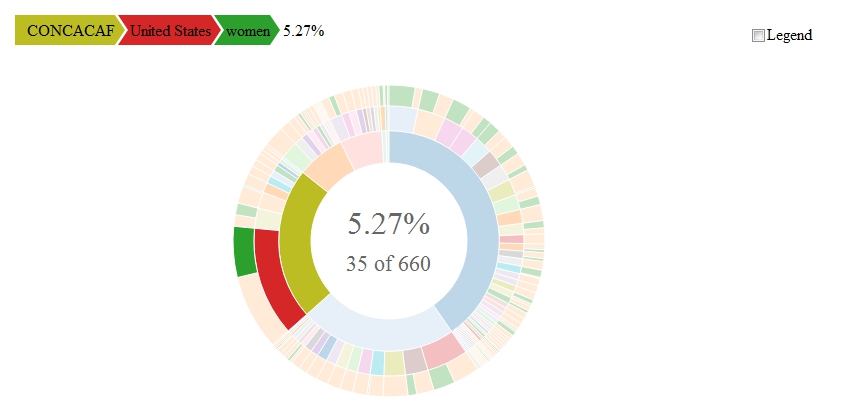
I figured out how to do something unspeakable awesome this evening. I encourage everyone who knows how to work with R (or any other coding language for that matter) to explore making sunbursts. This amazing hierarchical dataviz tool is not only great for showing sequential subdivisions of groups but are also interactive, at least when built using the sunburstR package. While in your viewing window (which for me is in RStudio), just move your cursor over any sequence of wedges from the inner ring to the outer ring, and you will get in return a display of the information represented by those wedges. The only downside right now is that I can't upload the interactive version of the sunburst I created. I have to figure out how to make a Shiny app first. But I was too excited to wait to share my discovery, so for now you'll have to put up with this teaser jpeg/screenshot of the sunburst I made, which is of all players--men and women--who according to this Wikipedia page have at least 100 caps.
When I move the mouse over the figure, the wedges that are not selected fade relative to those that are selected. The path I am illustrating here is percent of all players with 100 or more caps who are women who play/ed for the United States. The inner ring is "confederation" (here, CONCACAF), the middle ring is "country" (USA), and the outer ring is "men or women". In this example, 5.27% of players with at least 100 caps are women who play/ed for the US of A. Curiously, the denominator in the center of the sunburst is wrong. It should be 664, not 660. I do not know why this is rounded down to the nearest 10 (the same thing happened with smaller datasets), but the percentage is correct (35/664=5.27%). One more thing to figure out in the coming days.
Here is the sunburst intact, without any highlighted path but with the legend activated.
The legend is really only useful for the inner ring, which has 7 different wedges. ("OFC/AFC" is there because some players for Australia bridged the transition of Australia from OFC to AFC.)
After reading the documentation for sunburstR and looking at a couple of examples, I thought this would take me several days of labor and trial and error to produce. But then I found this exchange at Stack Overflow and, by modifying some of the code I found there, I was able to create the necessary paths to plot my data and produce this amazing figure in less than an hour. Again, the interactivity of this sunburst is a wonderful feature. I hope that rendering an interactive version online for you all to experience will be as smooth as making the sunburst was in the first place.
 |
| (click to enlarge) |
When I move the mouse over the figure, the wedges that are not selected fade relative to those that are selected. The path I am illustrating here is percent of all players with 100 or more caps who are women who play/ed for the United States. The inner ring is "confederation" (here, CONCACAF), the middle ring is "country" (USA), and the outer ring is "men or women". In this example, 5.27% of players with at least 100 caps are women who play/ed for the US of A. Curiously, the denominator in the center of the sunburst is wrong. It should be 664, not 660. I do not know why this is rounded down to the nearest 10 (the same thing happened with smaller datasets), but the percentage is correct (35/664=5.27%). One more thing to figure out in the coming days.
Here is the sunburst intact, without any highlighted path but with the legend activated.
 |
| (click to enlarge) |
The legend is really only useful for the inner ring, which has 7 different wedges. ("OFC/AFC" is there because some players for Australia bridged the transition of Australia from OFC to AFC.)
After reading the documentation for sunburstR and looking at a couple of examples, I thought this would take me several days of labor and trial and error to produce. But then I found this exchange at Stack Overflow and, by modifying some of the code I found there, I was able to create the necessary paths to plot my data and produce this amazing figure in less than an hour. Again, the interactivity of this sunburst is a wonderful feature. I hope that rendering an interactive version online for you all to experience will be as smooth as making the sunburst was in the first place.

Comments
Post a Comment