Map Time: Plotting the Hometowns of MLS Players on a US Map (Phase 1)
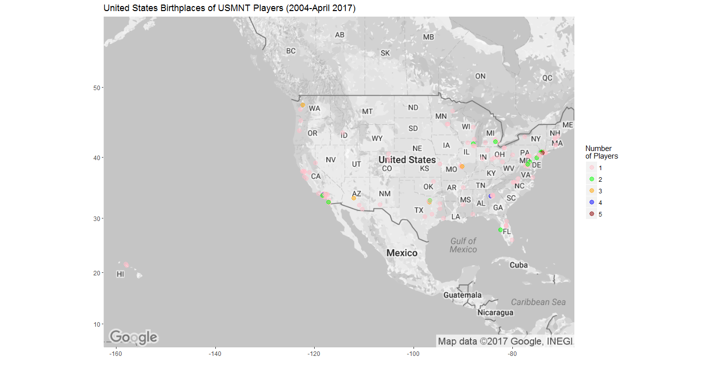
I have wanted to use R to plot data on a map from the moment I learned that it was a possibility. Now that I have my USISSL dataset, I thought I'd take my first steps in that world. Here is the result, although the attentive reader will note that this figure does not included all current MLS players for reasons explained below:

As with everything when using R, plotting on a map involved a tremendous amount of trial and error coupled with a generous helping of web searches for guidance and examples. Thank goodness for sites like Stack Overflow, where I came across this question about plotting population density on a map. I spent a lot of time trying to modify this code to fit my aims. This process took me down several rabbit holes, some of which contained additional, directly useful information. I also adopted some of the code that I had developed for building the USISSL league table. With all of these ingredients in place, I was able to generate some results.
The code in the Stack Overflow submission included 7 different packages. I'm not sure if I needed them all, but I installed them all anyway. Of these packages, maps, ggplot2, and ggmap were the most obviously necessary.
In order to plot the hometowns of MLS players on a map of the United States, I needed the latitude and longitude of each of the hometowns in my USISSL dataset. I certainly wasn't going to enter all of these by hand, so I needed to find an extant dataset with the same information that I could then merge with my dataset. I found a couple such datasets and finally settled on one called "us.cities", which is part of the maps package, in part because I could actually make it work with my dataset.
us.cities is not a comprehensive list of all cities in the United States. Rather, it purports to include all US cities with at least approximately 40,000 residents. This means that some of the hometowns in my dataset are not in the us.cities dataset and thus are not included in the map above.
There were other issues with the us.cities dataset. One was that us.cities has the city name and state abbreviation combined in one column and separated by a single space whereas my dataset has city in one column and state in another. In order to compare these two datasets and match up coordinates from one with the cities in the other, this information needed to be in the same format. I elected to combine the hometown and home state columns in my dataset into one column called "CityState" in a new dataframe called "hometowns":
The other issue is that the names of the cities in my dataset might not match those in the us.cities dataset. (Fortunately both datasets use the same two letter state abbreviations.) For example, my dataset uses "St. Louis", but us.cities uses "Saint Louis". Discrepancies like these mean that yet more players are omitted from the map above. My intention is to go through the datasets to make changes to city name formats and add all coordinates, but that will be for a later date. However, given that St. Louis is the hometown of more MLS players than any other town in the US, I felt I had to make that change now. This is the code that I used to make that change:
I then determined the number of players from each hometown in my USISSL dataset:
When I call str on HomeTownCount, I am told that this new dataframe contains 256 observations; in other words, there are 256 unique hometowns in my USISSL dataset.
I then used the subset function to create a dataframe consisting of only those rows in us.cities with cities that also appear in my USISSL dataset:
Calling str on hometownlatlong reveals a total of 133 observations, meaning that I have lost nearly half of the cities that appear in my USISSL database. This is disappointing, but as I said, I hope to correct this in future iterations of this exercise. Right now I am more interested in proof of concept than completeness of results.
I wanted my map to indicate the number of MLS players from each of the cities left in my dataframe, not just the locations of their hometowns. To do this, I added a column to the hometownlatlong dataframe and used the "match" function to put the correct player count number in the correct city row:
Next I obtained a map of the contiguous United States (there are no current MLS players with hometowns in Alaska or Hawaii). Try as I might, I could not get the entire map to fit at zoom level 4 and zoom level 3 is too far away. Another issue to work on later (sorry, eastern part of Maine). But I was able to crop the map such that most of Canada and Mexico are excluded. I was also able to remove the names of the countries from the map, which was a nice discovery because "United States" was over several plot points.
At last I had everything in place to plot my (remaining) data on a map. All that was left was the last few lines of code:
I included "Partial" in the title of the figure because of the limitations above. Hopefully I can address those limitations soon and create a complete plot map with all 311 players and all 256 hometowns. But for now, I am pleased with my first attempt at using R to plot data on a map.
As with everything when using R, plotting on a map involved a tremendous amount of trial and error coupled with a generous helping of web searches for guidance and examples. Thank goodness for sites like Stack Overflow, where I came across this question about plotting population density on a map. I spent a lot of time trying to modify this code to fit my aims. This process took me down several rabbit holes, some of which contained additional, directly useful information. I also adopted some of the code that I had developed for building the USISSL league table. With all of these ingredients in place, I was able to generate some results.
The code in the Stack Overflow submission included 7 different packages. I'm not sure if I needed them all, but I installed them all anyway. Of these packages, maps, ggplot2, and ggmap were the most obviously necessary.
In order to plot the hometowns of MLS players on a map of the United States, I needed the latitude and longitude of each of the hometowns in my USISSL dataset. I certainly wasn't going to enter all of these by hand, so I needed to find an extant dataset with the same information that I could then merge with my dataset. I found a couple such datasets and finally settled on one called "us.cities", which is part of the maps package, in part because I could actually make it work with my dataset.
us.cities is not a comprehensive list of all cities in the United States. Rather, it purports to include all US cities with at least approximately 40,000 residents. This means that some of the hometowns in my dataset are not in the us.cities dataset and thus are not included in the map above.
There were other issues with the us.cities dataset. One was that us.cities has the city name and state abbreviation combined in one column and separated by a single space whereas my dataset has city in one column and state in another. In order to compare these two datasets and match up coordinates from one with the cities in the other, this information needed to be in the same format. I elected to combine the hometown and home state columns in my dataset into one column called "CityState" in a new dataframe called "hometowns":
> hometowns<-unite(league_5, "CityState", Home.Town, Home.State, sep=" ") | |
> hometowns$CityState<-replace(hometowns$CityState, hometowns$CityState=="St. Louis MO", "Saint Louis MO")
I then determined the number of players from each hometown in my USISSL dataset:
> HomeTownCount<-count(hometowns, CityState)
When I call str on HomeTownCount, I am told that this new dataframe contains 256 observations; in other words, there are 256 unique hometowns in my USISSL dataset.
I then used the subset function to create a dataframe consisting of only those rows in us.cities with cities that also appear in my USISSL dataset:
> hometownlatlong<-subset(us.cities, name %in% hometowns$CityState)
Calling str on hometownlatlong reveals a total of 133 observations, meaning that I have lost nearly half of the cities that appear in my USISSL database. This is disappointing, but as I said, I hope to correct this in future iterations of this exercise. Right now I am more interested in proof of concept than completeness of results.
I wanted my map to indicate the number of MLS players from each of the cities left in my dataframe, not just the locations of their hometowns. To do this, I added a column to the hometownlatlong dataframe and used the "match" function to put the correct player count number in the correct city row:
> hometownlatlong$players<-HomeTownCount$n[match(hometownlatlong$name, HomeTownCount$CityState)] |
Next I obtained a map of the contiguous United States (there are no current MLS players with hometowns in Alaska or Hawaii). Try as I might, I could not get the entire map to fit at zoom level 4 and zoom level 3 is too far away. Another issue to work on later (sorry, eastern part of Maine). But I was able to crop the map such that most of Canada and Mexico are excluded. I was also able to remove the names of the countries from the map, which was a nice discovery because "United States" was over several plot points.
> USA <- get_googlemap(center="Junction City", zoom=4, size= c(640, 400), maptype="roadmap", style = 'feature:administrative.country|element:labels|visibility:off')
At last I had everything in place to plot my (remaining) data on a map. All that was left was the last few lines of code:
> ggmap(USA) + geom_point(data=hometownlatlong, aes(x=long, y=lat, size=players), alpha = 0.3) +
+ labs(x="", y="", size="Number of Players") +
+   ggtitle("2017 MLS Players with Hometowns in the United States (Partial)")
I included "Partial" in the title of the figure because of the limitations above. Hopefully I can address those limitations soon and create a complete plot map with all 311 players and all 256 hometowns. But for now, I am pleased with my first attempt at using R to plot data on a map.

Comments
Post a Comment