Lower 48 Word Cloud of all USMNT Players Since 1916
While working on a "real word" R project this week, I discovered how to create a word cloud (roughly) resembling the shape of something. This uses the wordcloud2 package and involves finding an image of the desired shape and then applying a data frame of words and word frequencies to that shape. For this post, I decided to use this Wikipedia list of players for the USMNT, which spans 1916 to March 2017 and includes the number of international appearances for each player. I had hoped to have the relative sizes of the players' names in the word cloud reflect number of caps, but this ended up leaving the names of players with 1 or 2 caps so tiny as to be illegible. Totally fortuitously, I stumbled upon a way simply to plot the names at roughly the same size, and after finding an appropriate silhouette of the United States, I produced this "formed" word cloud:
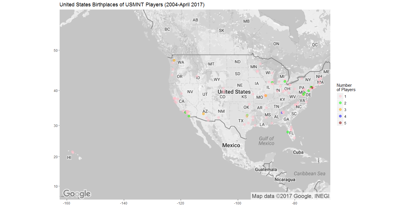
I initially tried to use a silhouette of the US that included Alaska and Hawaii, but the result was that only a couple of names would show up as Alaska and no names popped up in the area of Hawaii.
Even though size does not correlate with frequency in this word cloud, I did notice that the players with the most caps tended to be plotted first and plotted centrally. I also noticed that some names would appear in the could only after a significant delay relative to most of the others, so I hope I waited long enough for all 741 players to appear in the saved image.
I need to spend more time with wordcloud2 to figure out a few things, like whether the image needs to be a silhouette, whether it needs to be a black on white silhouette in particular, whether the image needs to be a .png file, and how to provide both lower AND upper limits to the sizes of the words so I can incorporate frequencies.
My fortuitous discovery that resulted in all names appearing large enough to be legible related to the "fontWeight" argument in the wordcloud2 function. According to the documentation for wordcloud2 ,
After researching space-efficient font families and deciding to try Tahoma, I mistakenly put "Tahoma" in the fontWeight argument rather than fontFamily. The result was similarly-sized, legible words. I then tried it with "Ariel", accidentally misspelling "Arial", but the result was the same. Furthermore, changing the "size" argument did not affect the font size at all. Very mysterious. But I like the results, inadvertent though they might be.
The wordcloud2 function is very simple to use. Once you have a data frame with "word" and "freq" columns and have an image you want to use as your form, it took only one line of code to produce the word cloud above. Here's that line in my code, with "Arial" correctly spelled this time:
Remarkably simple, although as I mentioned above, I have a few questions I need to try to answer in order to produce optimized word clouds using this package.
 |
| (click to enlarge) |
I initially tried to use a silhouette of the US that included Alaska and Hawaii, but the result was that only a couple of names would show up as Alaska and no names popped up in the area of Hawaii.
Even though size does not correlate with frequency in this word cloud, I did notice that the players with the most caps tended to be plotted first and plotted centrally. I also noticed that some names would appear in the could only after a significant delay relative to most of the others, so I hope I waited long enough for all 741 players to appear in the saved image.
I need to spend more time with wordcloud2 to figure out a few things, like whether the image needs to be a silhouette, whether it needs to be a black on white silhouette in particular, whether the image needs to be a .png file, and how to provide both lower AND upper limits to the sizes of the words so I can incorporate frequencies.
My fortuitous discovery that resulted in all names appearing large enough to be legible related to the "fontWeight" argument in the wordcloud2 function. According to the documentation for wordcloud2 ,
fontFamily |
Font to use.
|
fontWeight |
Font weight to use, e.g. normal, bold or 600
|
After researching space-efficient font families and deciding to try Tahoma, I mistakenly put "Tahoma" in the fontWeight argument rather than fontFamily. The result was similarly-sized, legible words. I then tried it with "Ariel", accidentally misspelling "Arial", but the result was the same. Furthermore, changing the "size" argument did not affect the font size at all. Very mysterious. But I like the results, inadvertent though they might be.
The wordcloud2 function is very simple to use. Once you have a data frame with "word" and "freq" columns and have an image you want to use as your form, it took only one line of code to produce the word cloud above. Here's that line in my code, with "Arial" correctly spelled this time:
> wordcloud2(USselect, fontWeight="Arial", figPath="US 48 sil map.png")
Remarkably simple, although as I mentioned above, I have a few questions I need to try to answer in order to produce optimized word clouds using this package.

Comments
Post a Comment